Work
About
Contact
UX Behind Thailand’s
Digital Arrival Card App
Project Overview
In 2025, Thailand reinstated its arrival card system to better manage tourist entries amidst growing free visa programs. Thai Immigration had an existing web-based solution, but they saw an opportunity to modernize the experience. Our mission? Design a digital version that would not only streamline arrival procedures but offer long-term benefits for travelers in Thailand.
My role: Lead Product Designer (UX/UI)
Timeline: Q2 2025
Team: Cross-functional, including product managers, developers, and legal advisors
Users: International tourists entering Thailand
The Challenge
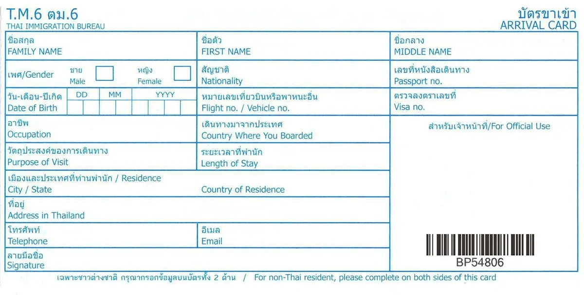

The traditional paper-based system was outdated. A standalone app already existed on the web, but it wasn’t optimized for mobile use or integrated with modern tools like KYC (Know Your Customer) verification. The immigration team wanted to reintroduce the arrival card in a way that felt effortless to the traveler—something quick, intuitive, and potentially beneficial for their entire stay.
But we had one big constraint: time. With tight development timelines, we needed to design something solid, scalable, and ready for phased rollout.
The Research Approach
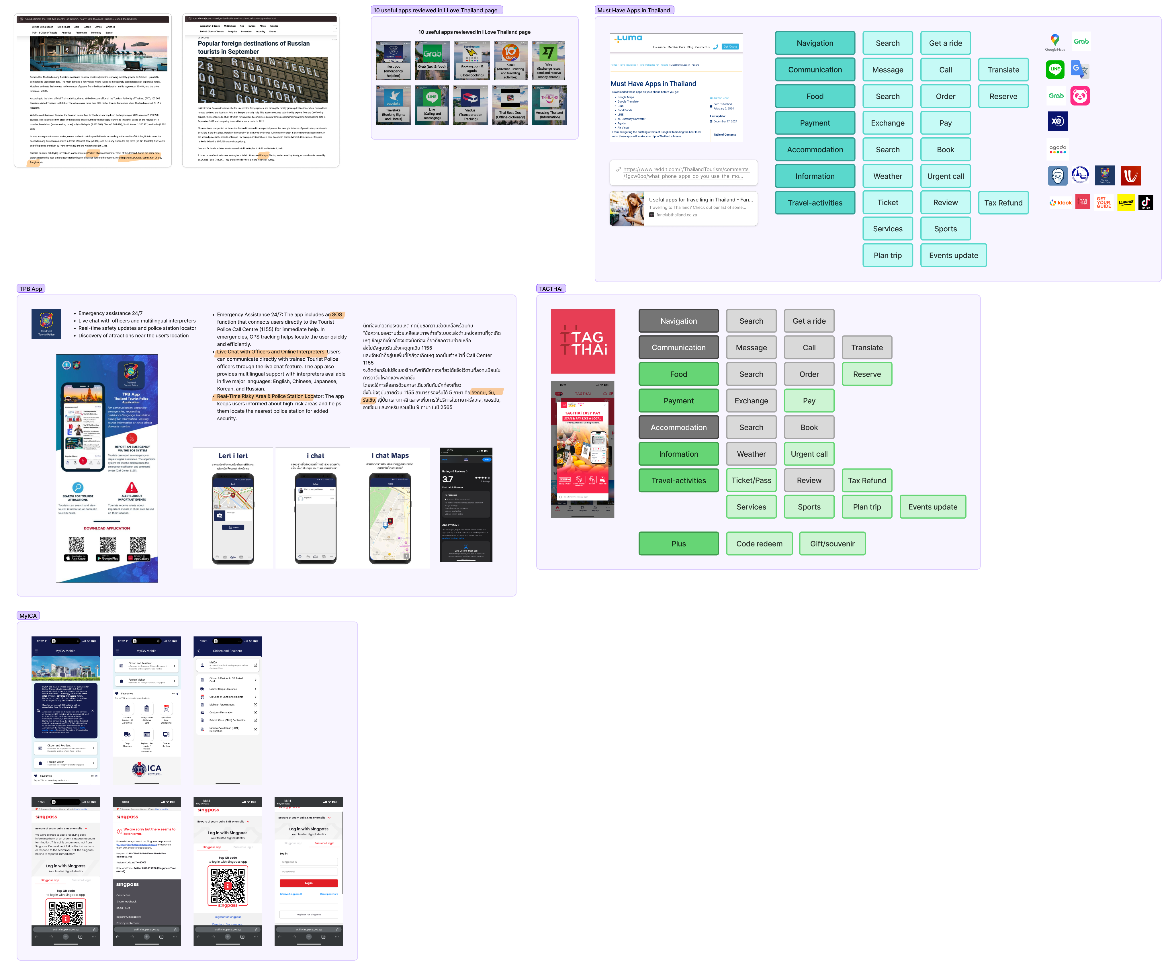
With limited time and no opportunity for user interviews, we took a pragmatic route. Our team explored similar apps on the market, dissected tourism-related apps, and read thousands of user reviews to understand pain points. Reddit, Facebook travel groups, and community forums became our data mines.
What we uncovered was invaluable:
- Users wanted to submit their arrival info as quickly and simply as possible.
- Travelers often helped friends or family with submissions, hinting at a need for multi-person support.
- Tourists were juggling several apps to navigate their stay—transport, attractions, local tips, even SIM cards.
That insight became our north star: simplify the entry process and eventually position the app as a hub for travel-related services in Thailand.
Ideation and Design Strategy
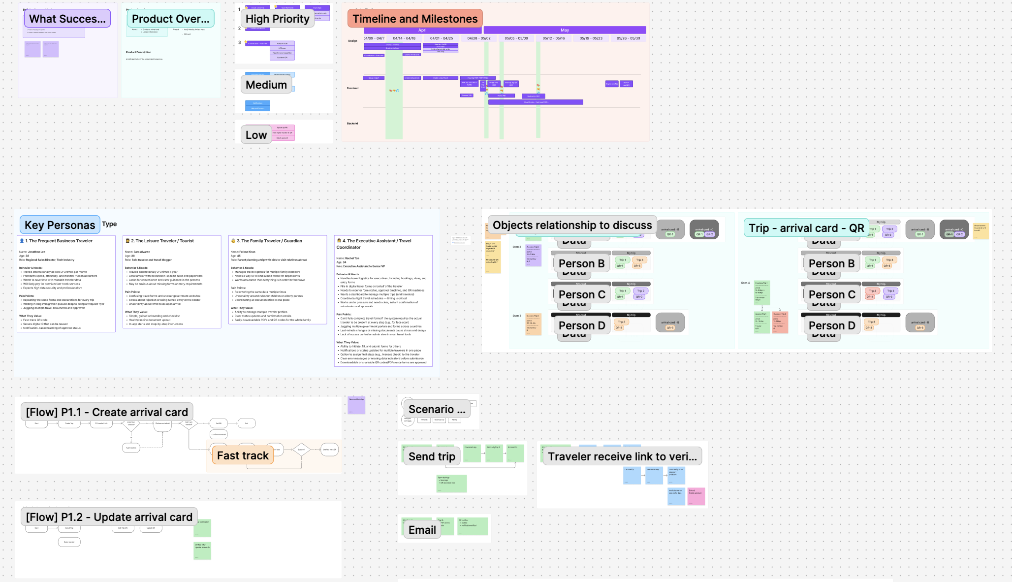
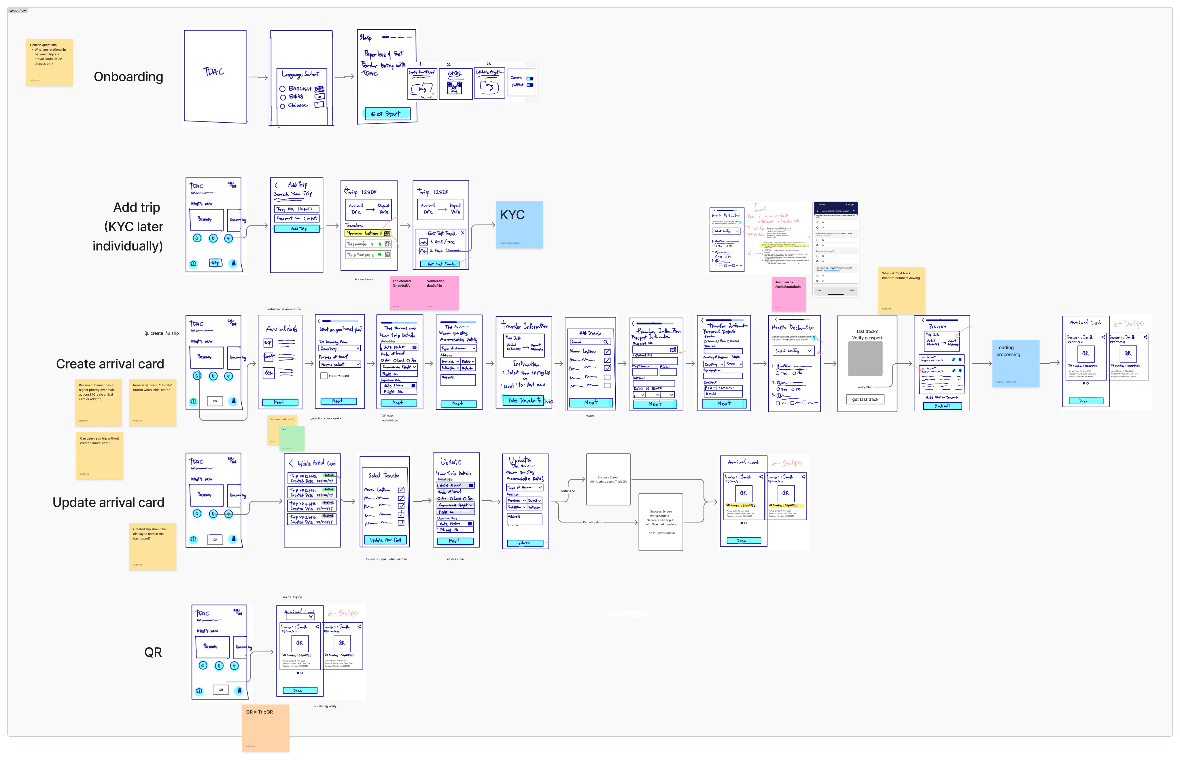
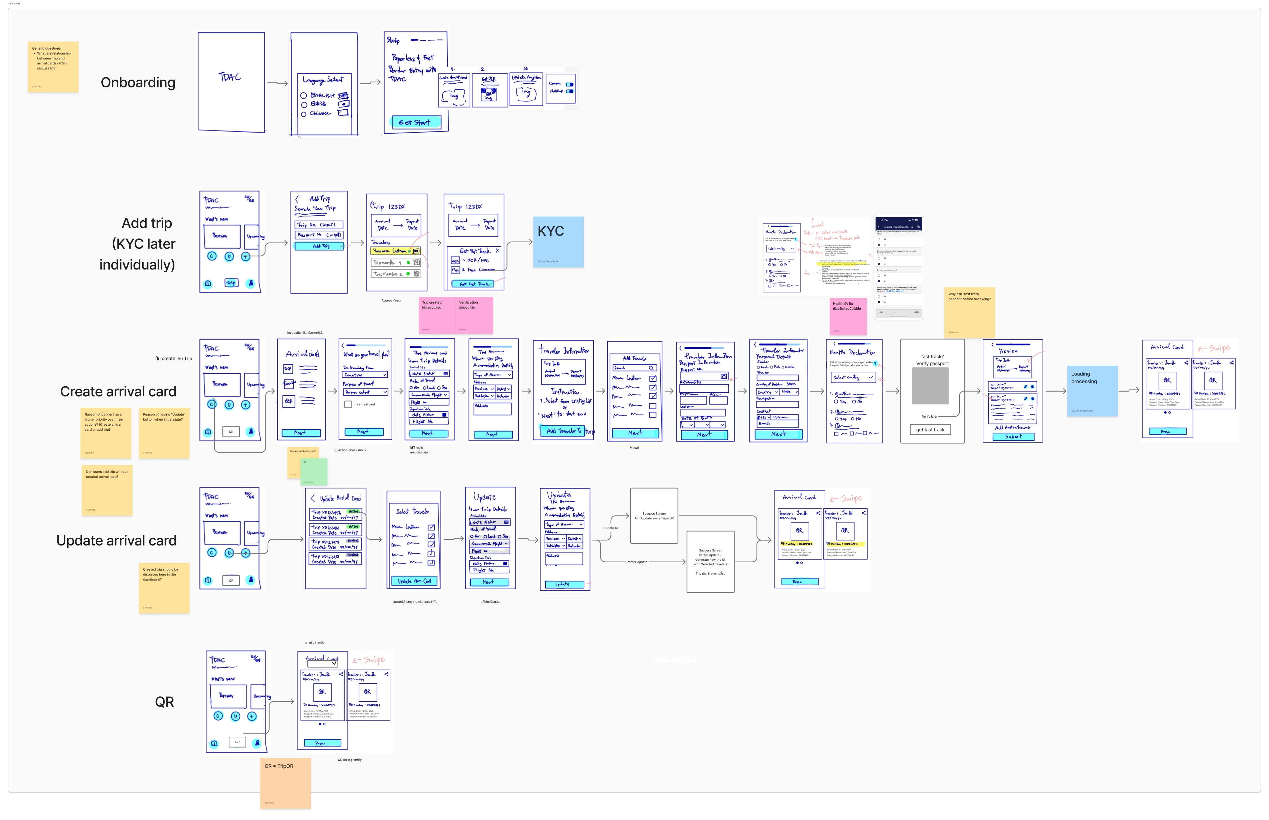
We focused our first phase on the core functionality—submitting the arrival card. Our process, while lean, was methodical:
- We mapped user stories and journeys
- Defined priority use cases
- Designed low-fidelity wireframes and prototypes
- Validated our assumptions through rapid testing with people who matched our core user scenarios
One early insight? People traveling as a group wanted to fill in info for everyone at once. That led us to create a batch submission feature. We tested and iterated until we found a balance between simplicity and completeness.
Throughout the process, I collaborated closely with developers, legal teams, and business stakeholders. Every decision required alignment—not only from a user perspective but also regulatory, legal, and technical feasibility. I used AI tools primarily to accelerate content creation within the app, from error messages to onboarding copy. It helped me refine communication quickly while keeping the tone accessible and friendly.
Testing and Iteration
Before handoff, we conducted usability testing with a close-to-final prototype. The interface was clean, the flows intuitive—but we did spot areas of friction. Some interactions were unclear, especially around identity verification. Rather than overhauling the design, we opted for small, high-impact adjustments to reduce confusion while preserving the minimal feel of the app.
The core structure remained intact across iterations. Changes focused more on refining interactions and aligning visuals with the technical feasibility within the dev timeline.
The Outcome
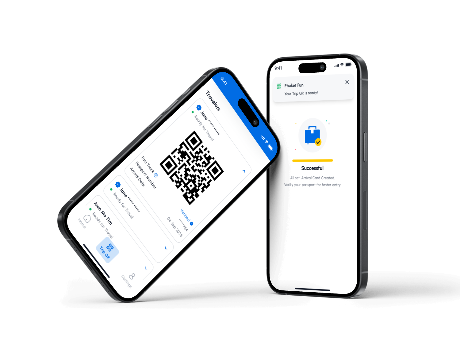
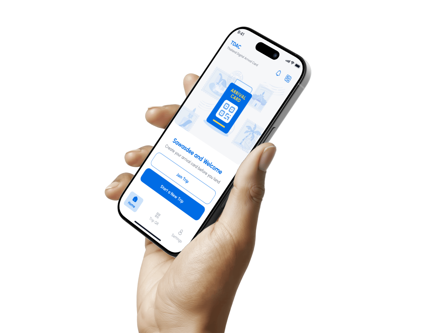
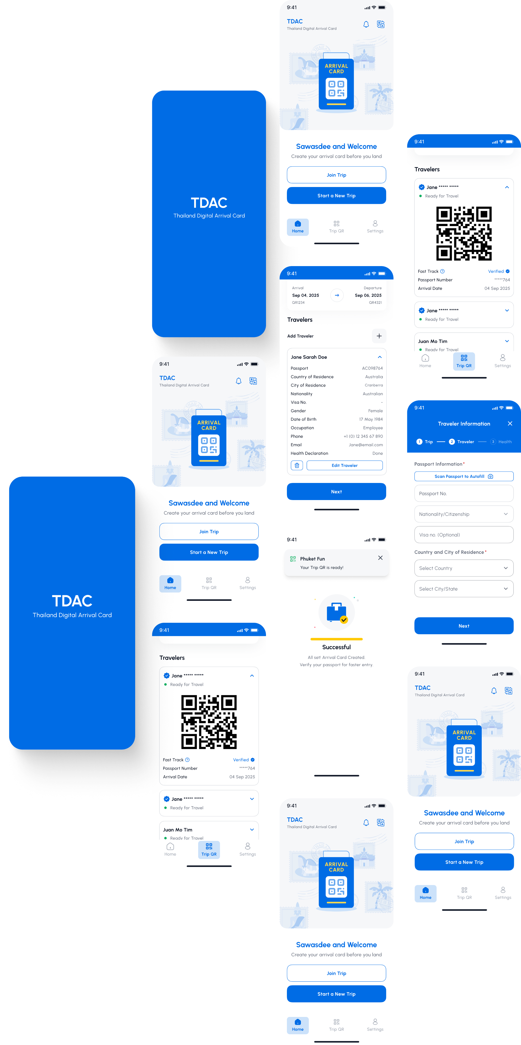
The first phase introduced the Thailand Digital Arrival Card (TDAC). Users could now:
- Submit their arrival card digitally for themselves or for a group
- Generate a QR code for border clearance
- Optionally upgrade their submission by verifying their identity via passport KYC, streamlining their entry at the airport
Though not yet launched as of this writing, the design laid the groundwork for a digital travel companion—one that could eventually integrate useful services for tourists, such as local transport info, emergency contacts, and visa info.
Reflections
This project wasn’t just about building an app. It was about navigating real-world constraints, aligning cross-functional teams, and designing for impact within a limited timeline. I learned more about collaboration than I expected—especially how legal and regulatory environments shape product scope in public sector work.
If I could change one thing, I’d advocate for more user research time. With even a few interviews, we could have validated some assumptions sooner and gone deeper into user motivations.
Still, I’m proud of what we delivered: a clean, scalable app grounded in real user needs, ready to support millions of travelers.
Work
About
Contact
UX Behind Thailand’s Digital Arrival Card App
Project Overview
In 2025, Thailand reinstated its arrival card system to better manage tourist entries amidst growing free visa programs. Thai Immigration had an existing web-based solution, but they saw an opportunity to modernize the experience. Our mission? Design a digital version that would not only streamline arrival procedures but offer long-term benefits for travelers in Thailand.
My role: Lead Product Designer (UX/UI)
Timeline: Q2 2025
Team: Cross-functional, including product managers, developers, and legal advisors
Users: International tourists entering Thailand
The Challenge

The traditional paper-based system was outdated. A standalone app already existed on the web, but it wasn’t optimized for mobile use or integrated with modern tools like KYC (Know Your Customer) verification. The immigration team wanted to reintroduce the arrival card in a way that felt effortless to the traveler—something quick, intuitive, and potentially beneficial for their entire stay.
But we had one big constraint: time. With tight development timelines, we needed to design something solid, scalable, and ready for phased rollout.
The Research Approach
With limited time and no opportunity for user interviews, we took a pragmatic route. Our team explored similar apps on the market, dissected tourism-related apps, and read thousands of user reviews to understand pain points. Reddit, Facebook travel groups, and community forums became our data mines.
What we uncovered was invaluable:
- Users wanted to submit their arrival info as quickly and simply as possible.
- Travelers often helped friends or family with submissions, hinting at a need for multi-person support.
- Tourists were juggling several apps to navigate their stay—transport, attractions, local tips, even SIM cards.
That insight became our north star: simplify the entry process and eventually position the app as a hub for travel-related services in Thailand.
Ideation and Design Strategy
We focused our first phase on the core functionality—submitting the arrival card. Our process, while lean, was methodical:
- We mapped user stories and journeys
- Defined priority use cases
- Designed low-fidelity wireframes and prototypes
- Validated our assumptions through rapid testing with people who matched our core user scenarios
One early insight? People traveling as a group wanted to fill in info for everyone at once. That led us to create a batch submission feature. We tested and iterated until we found a balance between simplicity and completeness.
Throughout the process, I collaborated closely with developers, legal teams, and business stakeholders. Every decision required alignment—not only from a user perspective but also regulatory, legal, and technical feasibility. I used AI tools primarily to accelerate content creation within the app, from error messages to onboarding copy. It helped me refine communication quickly while keeping the tone accessible and friendly.
Testing and Iteration
Before handoff, we conducted usability testing with a close-to-final prototype. The interface was clean, the flows intuitive—but we did spot areas of friction. Some interactions were unclear, especially around identity verification. Rather than overhauling the design, we opted for small, high-impact adjustments to reduce confusion while preserving the minimal feel of the app.
The core structure remained intact across iterations. Changes focused more on refining interactions and aligning visuals with the technical feasibility within the dev timeline.
The Outcome
The first phase introduced the Thailand Digital Arrival Card (TDAC). Users could now:
- Submit their arrival card digitally for themselves or for a group
- Generate a QR code for border clearance
- Optionally upgrade their submission by verifying their identity via passport KYC, streamlining their entry at the airport
Though not yet launched as of this writing, the design laid the groundwork for a digital travel companion—one that could eventually integrate useful services for tourists, such as local transport info, emergency contacts, and visa info.
Reflections
This project wasn’t just about building an app. It was about navigating real-world constraints, aligning cross-functional teams, and designing for impact within a limited timeline. I learned more about collaboration than I expected—especially how legal and regulatory environments shape product scope in public sector work.
If I could change one thing, I’d advocate for more user research time. With even a few interviews, we could have validated some assumptions sooner and gone deeper into user motivations.
Still, I’m proud of what we delivered: a clean, scalable app grounded in real user needs, ready to support millions of travelers.